Agency: Merz Branding
Client: The Equity Project
Category: Branding
The Equity Project is committed to creating spaces for low-income families, especially families of color, in Kensington, Philadelphia to give them resources to reach their full potential. Programs at The Equity Project are grounded in human dignity, community-driven, responsive, and collaborative.
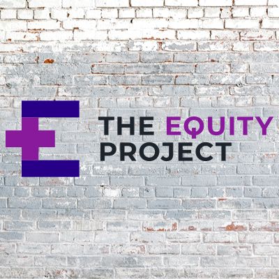
This logo uses an “E” that highlights two parts. The top and bottom lines of the ‘E’ are highlighted to form an equal sign. The middle line is extended to form a plus sign. This represents that for things to be balanced, more resources, commitment, and funding are needed. The word equity is highlighted in the same purple as the “E” to emphasize what this project is striving for. The “Q” in “Equity” uses a subtle icon for power.